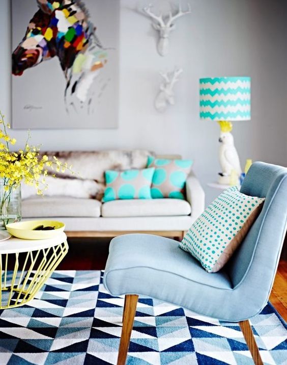
It's not a surprise that turquoise was chosen in a poll by the Design in Colours readers as their favorite colour! It was closely followed by pink... and I have to admit the two of them are also my favorites! They are wonderful on their own, but even greater together.
But, since I promised I will dedicate an entire article to the winning-colour, turquoise is our star today! It's simple to see why it's so appreciated: everything and everybody looks absolutely great in it!
And Pantone Institute knows that. Its experts even chose turquoise as the Color of the Year in 2010. Their explanation: "Combining the serene qualities of blue and the invigorating aspects of green, Turquoise inspires thoughts of soothing, tropical waters and a comforting escape from the everyday troubles of the world, while at the same time restoring our sense of wellbeing".
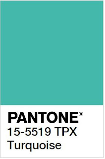 |
| Pantone |
Turquoise, the color psychology
Turquoise is a mix of blue, green and a bit of yellow, therefore it carries many of these colours' attributes. It communicates the
calm and relaxation of blue, it blends them with the
balance of green and the
optimism and fun of yellow.
According to some experts, turquoise is the colour of compassion and inner healing and it relates to our ability to love ourselves and the others. It is the colour that most people respond to positively, no matter if men or women.
Turquoise, the gemstone
Turquoise has been considered for thousands of years in many cultures of the world, from Egypt, to the Persian Empire and to the Aztecs, a holy stone, a bringer of good fortune and a talisman. For example, the ancient Persians used to wear these gemstones as a necklace or a bracelet as protection against unnatural death.
Turquoise in architecture
The great cultures of antiquity also used turquoise as an ornamental stone.
The Aztecs, for example, used the turquoise in mosaic objects such as masks or shields, together with gold, quartz, jade or coral. The ancient Persians considered turquoise their national stone, using it extensively to decorate all sort of objects and buildings, both inside and out. The Persians brought the passion for turquoise in India - the famous Taj Mahal is a great example for the use of this gemstone.
The ancient Egyptians were also charmed by it and experts could trace the use of the gemstone right to the First Dynasty. The most famous Egyptian object, Tutankhamun's gold burial mask, was inlaid with turquoise, alongside lapis lazuli, carnelian and coloured glass.
Decorating with turquoise
The beauty of turquoise can be accentuated through the use of other colours, especially through its complementary colour,
red-orange.
According to Pantone Color Institute, turquoise pairs nicely with any other colour in the spectrum.
"Turquoise adds a splash of excitement to neutrals and browns, complements reds and pinks, creates a classic maritime look with deep blues, livens up all other greens, and is especially trend-setting with yellow-greens".
My favorites: I would pair turquoise and white for a fresh feeling, together with coral accents. For a sweet effect, the perfect combination would be turquoise, white and pink.