Hi, I am Cristina, a journalist passioned about interior design and the world of colours.
Showing posts with label color of the year. Show all posts

Tuesday, 3 January 2017


This year it seems will gonna be fresh, natural and full of energy. Or at least, this is what the Pantone Color of the Year 2017 inspires us. Pantone Color Institute revealed the color that will influence at most the world of design in 2017: it is called Greenery. The 2017 color palettes that include Greenery are also very optimistic and lively and it is such a pleasure to watch them.

hookedonhouses.net

According to Pantone Color Institute, Greenery is a "fresh and zesty yellow-green shade that evokes the first days of spring when nature's greens revive, restore and renew. Illustrative of flourishing foliage and the lushness of the great outdoors, the fortifying attributes of Greenery signals consumers to take a deep breath, oxygenate and reinvigorate". Pantone also considers Greenery as the "nature's neutral".

Pantone Color of the Year 2017: Greenery

"Greenery bursts forth in 2017 to provide us with the reassurance we yearn for amid a tumultuous social and political environment. Satisfying our growing desire to rejuvenate and revitalize, Greenery symbolizes the reconnection we seek with nature, one another and a larger purpose", says Leatrice Eiseman, Executive Director of the Pantone Color Institute.

The institute created 10 color palettes that work perfectly with Greenery. 2017's color of the year is paired with neutral, brights, deeper shades, pastels and metallics and even with last year's colors, Rose Quartz and Serenity. My personal favorites are Rev it up and Fathomless, because they bring so much joy in the house: they are all bright and beautiful colors.


Pantone Color Institute

My personal advice is to take into consideration these palettes, but do not overuse them. Use a neutral color as the main one - I would choose white in this case, because it works perfectly with the Greenery one, then add Greenery as a second color and then some other colorful touches, according to the chosen palette. 

For example, in the Rev it up palette: I would choose the Brilliant White as the main color (walls and some furniture), then Greenery for bigger decorations items like a sofa and then the other colors for different accessories. For example, a carpet or pillows that contain Greenery, Fandango and Dazzling Blue or any other combinations. Just play with the palette as you dream to. 

Here are some beautiful decorating ideas for every room of the house, using the Greenery colour.

frenchbydesignblog.com

shelterness.com
onekingslane.com

mylittleitch.tumblr.com
carlaaston.com
mydomaine.com
faceliftfurniture.com
mydesignchic.com
conceptsandcolorways.stfi.re
apartmenttherapy.com
theenglishroom.biz
nonagon.style
achadosdedecoracao.com.br
topinspirations.com

Monday, 5 September 2016

Every season influences our mood and that's not just because of the weather, but also because of the natural colours that surround us. Each season has its own special colour palette, but this doesn't mean that each year has to be the same. It would be quite boring, don't you think so? That's why Pantone Color Institute chooses each year a special colour as the main trend in design, but it also shows us which are the colour trends each spring and autumn season.

Photo: Emily Henderson
The Fall 2016 colour palette is joyful and quite varied. It is dominated by blue, but we can also find yellow and pink shades and that's what it makes it so fun. According to Pantone, the desire for tranquility, strenght and optimism have inspired the their choices.


Vibrant colours are put together with "anchoring" earth tones. As Pantone says on its website, "Blue skies represent constancy as they are always above us. Grays give a feeling of stability, Red tones invite confidence and warmth, while the hot Pinkish Purples and Spicy Mustard Yellows suggest a touch of the exotic".

Here are some ideas of home decor using this season's colour palette. But, of course, you can mix them and create your own colour palette.

1. Riverside


Photo: conceptsandcolorways.com

Photo: conceptsandcolorways.com

2. Airy Blue 


Photo: plumprettysugar.blogspot.de
Photo: www.urbanara.de

3. Sharkskin 


Photo: www.guiaparadecorar.com

4. Aurora Red 


Photo: designzoom.ru

Photo: designzoom.ru

5. Warm Taupe


Photo: www.myscandinavianhome.com

6. Dusty Cedar


Photo: lapeinturequichangetout.fr

7. Lush Meadow


8. Spicy Mustard


Photo: frenchyfancy.com

9. Potter's Clay


Photo: conceptsandcolorways.com

10. Bodacious


Photo: www.bloglovin.com

Monday, 30 May 2016


It's not a surprise that turquoise was chosen in a poll by the Design in Colours readers as their favorite colour! It was closely followed by pink... and I have to admit the two of them are also my favorites! They are wonderful on their own, but even greater together.

But, since I promised I will dedicate an entire article to the winning-colour, turquoise is our star today! It's simple to see why it's so appreciated: everything and everybody looks absolutely great in it!

And Pantone Institute knows that. Its experts even chose turquoise as the Color of the Year in 2010. Their explanation: "Combining the serene qualities of blue and the invigorating aspects of green, Turquoise inspires thoughts of soothing, tropical waters and a comforting escape from the everyday troubles of the world, while at the same time restoring our sense of wellbeing".
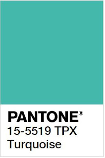
Pantone

Turquoise, the color psychology

Turquoise is a mix of blue, green and a bit of yellow, therefore it carries many of these colours' attributes. It communicates the calm and relaxation of blue, it blends them with the balance of green and the optimism and fun of yellow.

According to some experts, turquoise is the colour of compassion and inner healing and it relates to our ability to love ourselves and the others. It is the colour that most people respond to positively, no matter if men or women.

Turquoise, the gemstone

Turquoise has been considered for thousands of years in many cultures of the world, from Egypt, to the Persian Empire and to the Aztecs, a holy stone, a bringer of good fortune and a talisman. For example, the ancient Persians used to wear these gemstones as a necklace or a bracelet as protection against unnatural death.

Turquoise in architecture

The great cultures of antiquity also used turquoise as an ornamental stone.

The Aztecs, for example, used the turquoise in mosaic objects such as masks or shields, together with gold, quartz, jade or coral. The ancient Persians considered turquoise their national stone, using it extensively to decorate all sort of objects and buildings, both inside and out. The Persians brought the passion for turquoise in India - the famous Taj Mahal is a great example for the use of this gemstone.

The ancient Egyptians were also charmed by it and experts could trace the use of the gemstone right to the First Dynasty. The most famous Egyptian object, Tutankhamun's gold burial mask, was inlaid with turquoise, alongside lapis lazuli, carnelian and coloured glass.

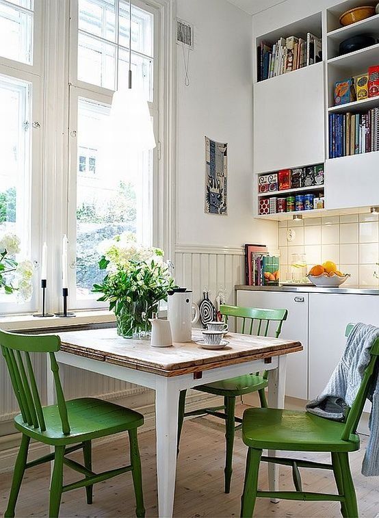
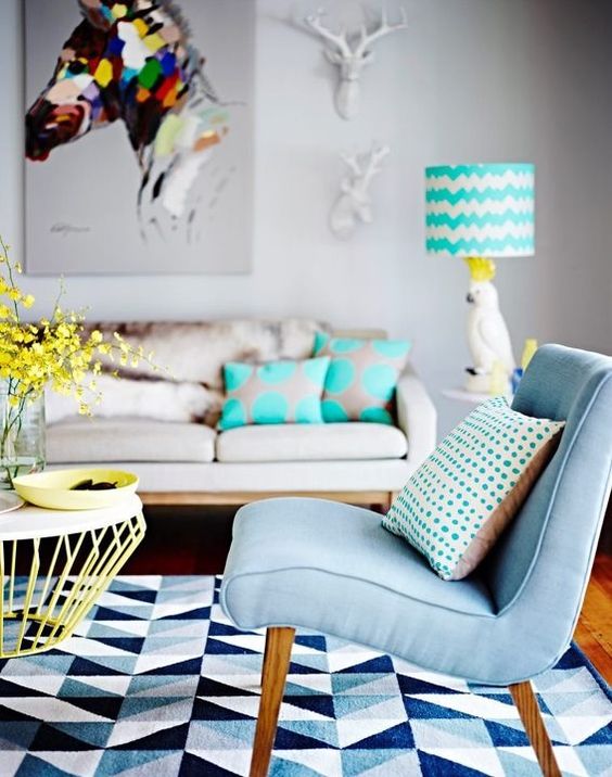
Decorating with turquoise

The beauty of turquoise can be accentuated through the use of other colours, especially through its complementary colour, red-orange.

www.houseofturquoise.com

According to Pantone Color Institute, turquoise pairs nicely with any other colour in the spectrum.
"Turquoise adds a splash of excitement to neutrals and browns, complements reds and pinks, creates a classic maritime look with deep blues, livens up all other greens, and is especially trend-setting with yellow-greens".

www.houseofturquoise.com


www.bloglovin.com
www.shopsocietysocial.com
My favorites: I would pair turquoise and white for a fresh feeling, together with coral accents. For a sweet effect, the perfect combination would be turquoise, white and pink.

www.bloglovin.com

www.shopsocietysocial.com
sugarandcloth.com
color-crazed.tumblr.com
www.bloglovin.com
www.lushome.com
www.houseofturquoise.com
www.jurnaldedesigninterior.com
www.houseofturquoise.com

www.houseofturquoise.com

Social

Find us on Facebook and Pinterest

Total Pageviews

Translate

Contact us

Name

Email *

Message *