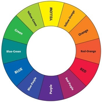
Before using colors in interior design, it's good to know some important facts about the basic color theory.
The 3 primary colors are red, blue and yellow. They cannot be made by mixing any other colors. These three colors are mixed to create all other colors and can be combined with white or black to create tints (lighter hues) and shades (darker hues) of these colors.
 |
| Primary and secondary colors |
Secondary colors are created mixing two of the three primary colors together. They are orange, green and purple.
 |
| Example of decor based on a primary color - blue |
Tertiary colors are made by mixing one primary color with one secondary color. These colors are red-orange, yellow-orange, yellow-green, blue-green, blue-violet and red-violet.
 |
| Primary, secondary and tertiary colors |
Additive primary colors are the primary color elements that make up white light. These colors are called additives because you must add the colors together to create white. The additive primary colors are red, green, and blue (commonly called RGB) as they are the primary color elements.
In contrast to combining the additive primary colors of red, green, and blue to make white, subtractive primary colors is a four-color printing process that uses cyan, magenta, yellow and black. This is often referred to as CMYK.
These are the hues, or the twelve purest and brightest colors.They form the full spectrum of colors which progress around the Primary Color Wheel in gradual increments.
 |
| Hues - the twelve purest colors |
A tint is a mixture of pure hue and white. Think of a color like red saturated with lots of white. As more white is added the color becomes a lighter and lighter tint of red, until it turns to pale pink.
 |
| Tint |
 |
| Shade |
A tone is created by adding both white and black which is grey. Any color that is "greyed down" is considered a Tone.
 |
| Tone |
- red and green
- blue and orange
- purple and yellow
 |
| Primary complementary colors |
 |
| Example of decor using complementary colors - blue and orange |
Then, there are the analogous colors. Three colors next to each other on the color wheel comprise an analogous color scheme. Here are three examples:
- red, orange, and yellow
- green, blue, and purple
- yellow, yellow-green, and green
 |
| Analogous Colors |
 |
| Example of a room decorated with analogous colors |
COMING NEXT:
How to use colors in interior design - Part 2: Color contrast
How to use colors in interior design - Part 3: The color psychology - The meaning of colors
References:
wikipedia.org
interiordec.about.com
color-wheel-artist.com


e.g.. of analogous color
ReplyDeleteValuable information and excellent design you got here! I would like to thank you for sharing your thoughts and time into the stuff you post!! Thumbs up! Big thanks for the useful information about home decorating ideas
ReplyDeleteUse of different colors in interior design gives a fresh look to a House Design and make it attractive.
ReplyDelete